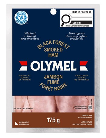
Olymel unveils new brand image


Olymel reveals a new look, which was created in collaboration with creative agency LG2.
According to a media statement, the rebranding’s main objective was to “highlight the quality of Olymel products, while making the brand more visible, contemporary and attractive.”
“In changing our brand image, we wanted to further highlight the quality of our products, already recognized internationally for their excellence. It was essential that this new corporate image reflects both our commitment to quality and the new direction we’ve taken, while respecting the essence of what makes us who we are,” said Daniel Rivest, senior vice-president, sales and marketing.
Olymel anchored the new identity around its iconic red and blue colours, while simplifying the logo to reinforce its visual impact.
The new identity will be rolled out progressively across all the brand’s physical and digital touchpoints, including packaging, advertising and signage. The goal is to ensure greater brand recognition, thereby strengthening the company’s market position and increasing.
Source: www.foodincanada.com

